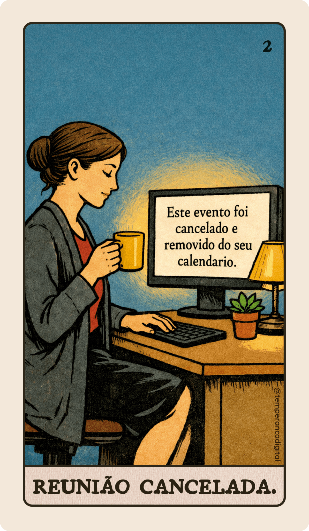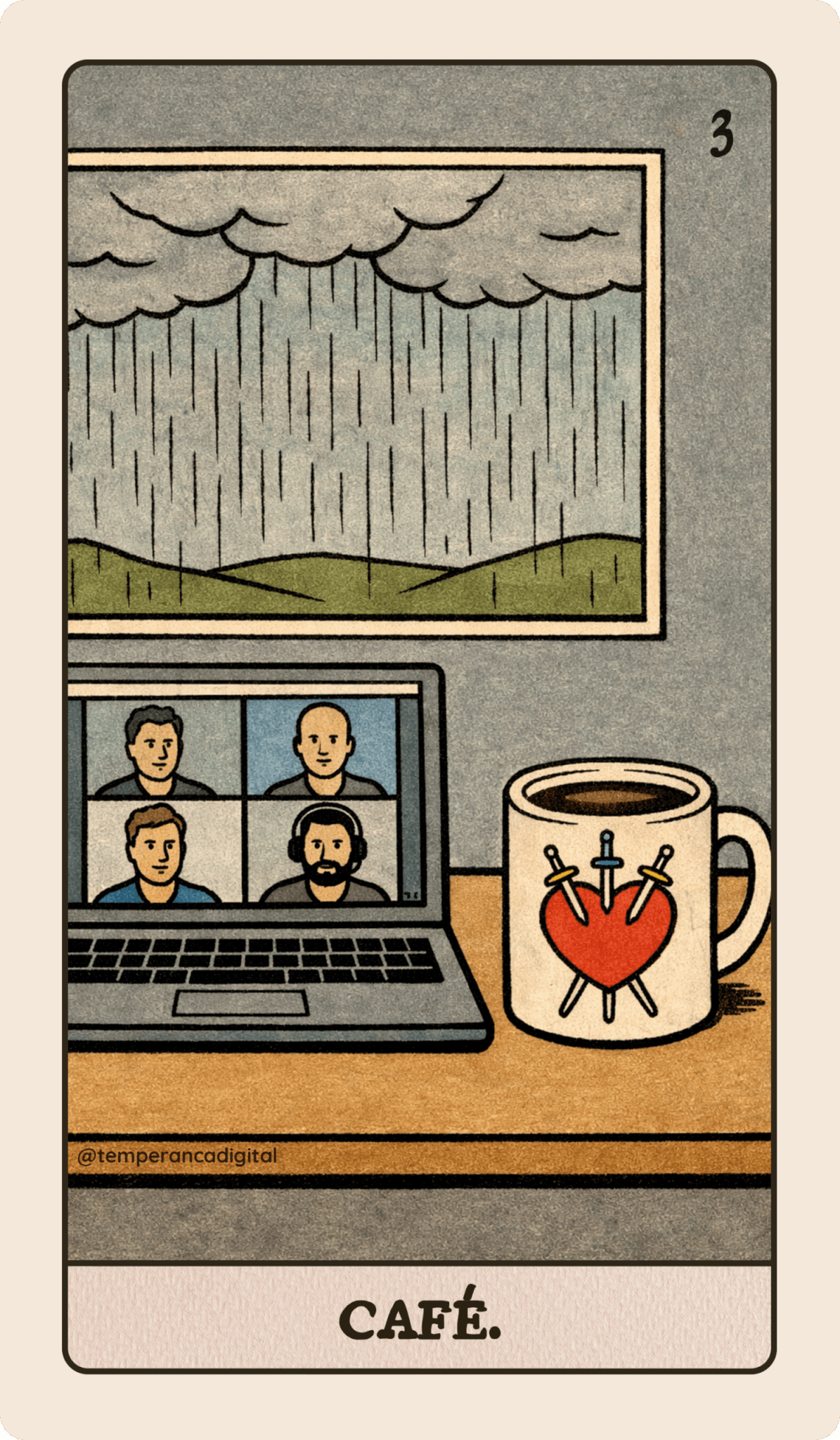
A terceira carta do deck Tarot Millennial é Café, nosso santo combustível do dia-a-dia ☕
Essa carta foi inspirada no Três de Espadas porque às vezes o que ajuda a gente a passar por um dia difícil é uma caneca de café quentinha mesmo. Aquele sofrimento profundo, as situações em que a gente precisa encarar a realidade, as conversas difíceis… tudo fica mais fácil com um cafezinho…
Usei a ilustração da carta original na caneca, com a chuvinha caindo lá fora pela janela. Imaginei a cena numa reunião online daquelas bem difíceis – repare que só tem macho branco na tela falando 😅
🃏✨🤖
Finalmente cheguei num prompt que parece ter funcionado – a carta da reunião cancelada saiu relativamente ok com ele:
Full-body illustration strictly in the original 1909 Rider–Waite tarot style, faithfully replicating the hand-drawn ink line work and flat gouache coloring of Pamela Colman Smith.

This illustration must be visually indistinguishable from an authentic Rider–Waite tarot card created in 1909. Not modern. Not digital painting. Not realistic. Not cinematic. Not cartoonish. Not stylized in any contemporary way.

Vertical composition, 2:3 aspect ratio.

Illustration only. No border. No frame. No title. No text. No numbering.

CORE VISUAL LANGUAGE (MANDATORY)
– Flat opaque gouache-style coloring
– Clearly defined black ink outlines – Consistent line weight
– No gradients
– No soft shading
– No painterly blending
– No glow effects
– No depth blur
– No 3D modeling
– No photographic lighting
– No modern rendering artifacts

Color palette must strictly resemble the Rider–Waite deck:
– Mustard yellow backgrounds
– Pale sky blue
– Olive green landscapes
– Muted red accents
– Cream skin tones
– Limited early 20th century print palette
– No saturated digital colors.

FIGURE PROPORTIONS (MANDATORY)

Human figures must follow Pamela Colman Smith’s proportions:
– Slightly elongated bodies
– Simplified hands
– Stylized but balanced anatomy
– No muscular realism
– No exaggerated curves
– No contemporary beauty standards
– Hands must be clearly drawn but simplified, with flat coloring and minimal shading.

FACE STRUCTURE LOCK (CRITICAL)

All faces must replicate the simplified facial grammar used in the original Rider–Waite deck.

Face requirements:
– Almond-shaped eyes
– Minimal iris detail
– Thin black ink outlines
– Small closed mouth
– Subtle, simplified nose
– No visible teeth
– No exaggerated eyebrows
– No raised cartoon expressions
– No large animated eyes
– No modern character design proportions

Facial expression must be archetypal and restrained.

Emotion must be conveyed through posture and symbolic composition, not exaggerated facial acting.

ANATOMY SAFETY LOCK (FOR HUMANS AND ANIMALS)
– One head per figure
– No duplicated facial features
– No extra limbs
– No distorted anatomy
– No surreal mutations
– No overlapping facial structures
– No warped perspective

Animals must have natural anatomy, correct number of limbs, and proportionate features.

SYMBOLIC PRIORITY

Symbolic clarity over realism. Balanced composition. Centered archetypal structure. Visual discipline consistent with early 20th century tarot illustration.

The final image must feel like it belongs physically inside the original Rider–Waite deck. The image must feel like a genuine Rider–Waite card illustration from 1909, reimagined in a millennial domestic setting.

No modern stylization. No digital gloss. No glossy highlights. No anatomical mutation. No surreal distortion. Symbolic tension. Archetypal composition. Emotional restraint within vintage structure.

LAYOUT OVERRIDE (MANDATORY)

The illustration must fill 100% of the image area.

– No card border
– No white margins
– No internal framing lines
– No decorative edges
– No rectangular card outline
– No visible card object

The image must be a full-bleed illustration extending to all four edges of the canvas.

There must be no visual separation between artwork and edge of image.

– This is not a photographed tarot card
– This is not a printed card mockup
– This is not a card with margins

The composition must extend completely to the edges of the frame.
Metade da criação da carta usa esse prompt fixo, e eu peço pro ChatGPT escrever a outra metade descrevendo a cena, o paralelo que eu quero fazer com a carta original e alguns detalhes dos objetos, roupas e expressões faciais. Junto tudo isso e jogo no Sora pra gerar a imagem – a partir daí eu vou só ajustando um detalhe ou outro. Aí os caras vão lá e descontinuam o Sora, que bom.
Como neste projeto só uso a criação de imagens estáticas, vou manter a geração das ilustrações no ChatGPT para não perder a consistência – e tentar terminar logo. Não tenho a menor intenção de parar a assinatura de uma ferramenta mais parruda de criação de imagens por enquanto, até porque o objetivo do projeto hoje é estudar e não monetizar.
Você pode concordar ou discordar de mim no Instagram, no Threads e no Bluesky.